Debt service charts in public finance are as ubiquitous as business cards at a shortlist presentation and date back to before Lotus 123 offered WYSIWYG. Unfortunately, they usually don’t look much different despite just a few improvements in technology over the last 20+ years. But what can you do to make a principal and interest graph sizzle? The answer is *a bunch of stuff* particularly with Excel 2007's new graphics engine. One rule of thumb (and pet peeve of ours): do not ever make your chart in more dimensions than the data. Debt service is expressed as amount vs time – two dimensions, not three. Three dimensional bar charts, pie charts, etc. just distort the data you're trying to accurately convey. For more details on this, and definitely if you're not already familiar, read from the master of data visualization, Professor Edward Tufte. But back to debt service…
Here are four quick ideas to add information content to those debt service visuals and prove you’re still innovating, even down into the basics of the business. The first three ideas are driven off of one Excel 07+ feature which allows you to create an invisible second Y-axis. This means you can show an outline of all sorts of interesting tidbits on the same graph, improving the vital data-ink ratio. Here are some examples:
1. Show Existing Debt Service Prior to Refinancing as Black Outline
There's a new debt service solution in town - variously and affectionately named “scoop & chuck”, “pitch & toss”, or even “extend & pretend.” Rating agencies are not big fans but it's out there nonetheless. How do you show in one graph what's been scooped and what's been chucked? It's easy. Create a 2nd vertical axis in Excel with the same scale and hash marks as the 1st vertical axis, graph the original debt service on it with bars that have a black border but "no fill". This way, the black outline of the bars not only clearly shows where prior debt service was, but also how much has been refunded - it's just the difference between the top of the black bars (unrefunded existing) and the top of the outline.
|
Showing Existing Debt Service Prior to Refinancing |
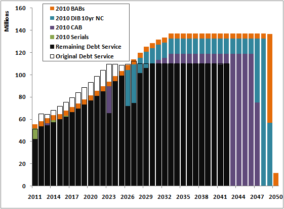
Here we see clearly the issuer's debt service prior to the refinancing, in the black outline, and then what remains after refinancing in black. New bond debt service components are reflected by the other colors.
2. Show refunded principal with a white hash mark
Expanding on the example above, if you're looking to break out debt services into principal and interest, show existing principal prior to a refinancing with a white hash mark. The difference between the white hash mark and unrefunded current principal (in black) is the amount of principal that was refunded in each maturity.
|
Showing Existing Principal Prior to Refinancing |
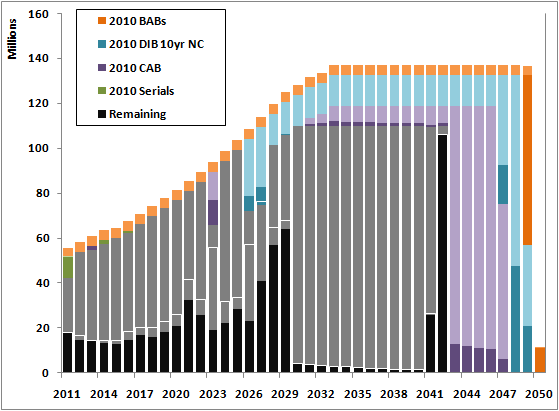
Dark shades of a color are principal; lighter shades interest. You can see the white hash indicates where principal was prior to the refinancing. Notice that where there's no refinancing, the hash marks coincide with the top of the bars representing original principal outstanding. You can achieve this white hash again by using the 2nd Y-axis and creating a panel of principal with data bars that have "No Fill" but a white outline.
In Part 2 we've got two more tips and a free download for the Excel spreadsheet and charts we used for both posts. Stay tuned and let us know what you think!
Comments