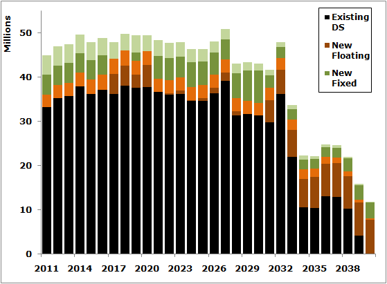
This is a continuation from Part 1 where we showed how to graph debt service and principal prior to the refinancing on the same chart as remaining and new debt service and principal.
3. Showing new deal in isolation and aggregate in outline bars
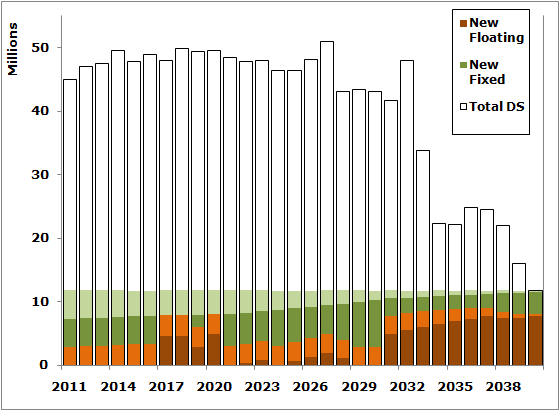
Sometimes the new financing isn't designed to wrap around the existing debt. That said, it's still important to see what the overall debt service looks like post new financing. Suppose that the new deal is level debt service. It won't look level if the solution is glommed onto the last ten deals in a lumpy existing structure. You'll get this
|
Showing New Deal in Isolation, Naïve Method |
You want to show the new structure is level not sitting on top of existing debt. You can do this the same way using the technique above - total debt service after the financing is reflected by clear bars with an outline on an invisible second Y-axis. The new debt is showed in color on the primary axis.
|
Showing Level New Deal With Total DS Outline |
4. Show 95% confidence Line Reflecting Risk
As I've commented on extensively before, maximum annual debt service (MADS) is meaningless without some sensitivity of debt service to market risk. Break out your trusty interest rate, basis risk, credit risk risk models and put that capital structure through the ringer. Once you've done that throw a 95 or 99% worst case line on the graph to display your risk management mojo.
|
Show 95% Confidence Line |
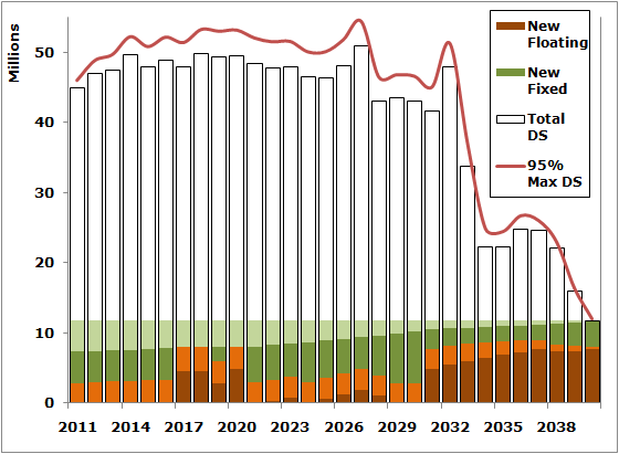
Obviously, this tweak can be added to any and all of the charts above, or even added to one of those plain, old debt service charts you use now.
Download the Excel spreadsheet and charts used for this post here.
Comments