We are honored this week to have a guest post from Win Smith, author of the The Well-Tempered Spreadsheet. Win is the president of Win Analytics LLC, an independent research and advisory firm.
In football, a quarterback “goes long” by heaving the ball down the field. If the play succeeds, the team advances many yards and might even score a touchdown. If the play fails, a down is wasted and there might even be an interception.
The U.S. Treasury's borrowing policies are not quite as exciting. Going long for the Treasury is not a risky call. Long-term borrowing protects against rising interest rates and reduces uncertainty. Although the longest security in the Treasury’s playbook is the 30-year bond, some commentators have urged the Treasury to go farther and lock in today’s low rates for a hundred years or beyond. On the other hand, the Fed has been buying up long treasurys, removing them from private hands in order to lower long rates and stimulate the economy. Some worry that the Treasury is undermining the Fed by flooding the market with long debt.
Many economists and financial journalists believe that the Treasury is going long, tilting its offerings toward more long-term debt and away from short-term debt. For example, the Wall Street Journal reported in June 2012 that “the Treasury Department has been ramping up its issuance of long-term debt to take advantage of historically low long-term rates.” This is both reassuring (the Treasury is guarding against higher rates), and worrying (the Treasury is impeding the Fed from boosting the economy).
The idea that the Treasury is going long owes to charts like this one from the Department:

The key terms here are “marketable U.S. Treasury securities” and “weighted average maturity.” The marketable securities are the short-term bills, medium-term notes, long-term bonds, and inflation-protected securities that the Treasury sells to fund the deficit and refinance older debt. The marketable securities make up the bulk of the national debt held by the public. About 350 such securities are currently outstanding.
The length of the marketable debt is usually measured by its “weighted average maturity.” This is the average remaining time to maturity for the securities (from a given date), weighted by their respective outstanding principal amounts. A $100 billion security carries ten times the weight of a $10 billion security in this calculation.
Looking at the chart above, it seems obvious that the Treasury is issuing more long-term debt. But there is an unrecognized assumption, that increases in average maturity imply sales of more long-term debt. This is the relationship between stocks and flows. Stocks in this sense are not like IBM or AAPL; these stocks are the levels of assets or liabilities at some point in time. Flows are movements over a period of time. Changes in the stock of Treasury debt should reveal the nature of the flows.
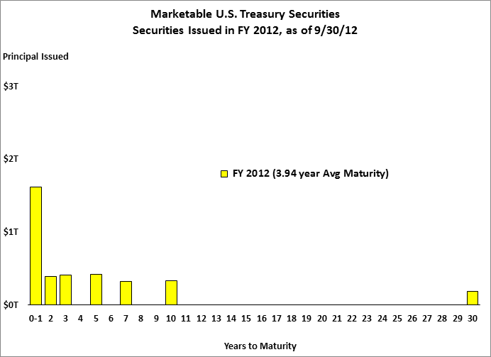
But is the Treasury really ramping up sales of long-term debt? Here is the debt issued in the last federal fiscal year, which closed on September 30, 2012. We consider the securities issued during the year, but exclude those that had already matured by the end of the year.

This is a heavily front-loaded basket of securities. Their weighted average maturity is under four years; 77% of them mature within five years; and less than 5% mature in thirty years.
Let's see how the average maturity of the FY 2012 issuance compares with earlier years and with the overall average of the marketable debt:

The average maturities for the new issuance were especially low in FY 2009. This was when the Treasury sold extraordinary levels of T-Bills in response to the financial crisis. The new issues lengthened after that, but shortened again from FY 2011 to FY 2012. The new issuance was always shorter than the overall debt, and yet somehow the overall average maturity continued to lengthen.
Why is the Average Maturity Lengthening?
We have a puzzle on our hands. The average maturity of the marketable debt continues to increase while the new issuance is shorter than average. How can this happen?
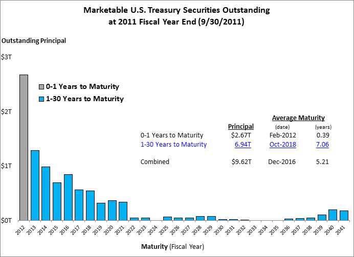
To solve the puzzle, let’s focus on the change from FY 2011 to FY 2012. Here is the debt as of September 30, 2011:

The securities are color-coded by remaining maturity. A gray bar represents the securities that were scheduled to mature within a year. The gray securities include recent bills as well as older notes and bonds. Their remaining average maturity was 0.39 years. The securities with more than a year remaining are indicated by blue bars. These securities totaled nearly $7 trillion and their remaining average maturity was 7.06 years. The combined average for of all of the securities was 5.21 years.
Now let’s look at the portfolio a year later, at the end of FY 2012:

The blue bars, representing the same $7 trillion in securities, are still here. The remaining average maturity for this group stepped down from 7.06 to 6.06 years since each blue security is now one year closer to maturity. The gray securities are gone because they all matured. The new securities issued in FY 2012 are shown in yellow, as in one of the charts above. These have an average maturity of 3.94 years. The overall average maturity is 5.39 years, an increase of .18 years over FY 2011.
We can understand what happened if we break down each year’s average into its components. I started with the largest group first and then found the incremental changes when smaller groups were added one at a time:
Components of the Average Life of the Marketable Debt
| Group |
FY 2011 |
FY 2012 |
Change |
| FY13-41, Issued by FY11 |
7.06 |
6.06 |
-1.00 |
| FY12, Issued by FY11 |
-1.85 |
1.85 |
|
| FY12 New Issues |
-0.73 |
-0.73 |
|
| FY12 Adjustments |
0.06 |
0.06 |
|
| Totals |
5.21 |
5.39 |
0.18 |
In FY 2011, we start with the blue group and its average of 7.06 years. The very short gray group pulled down the average by 1.85 years. The gray group had a significant impact because it constituted about a quarter of the debt.
In FY 2012, the blue group was down to 6.06 years and the gray group was gone. The new issuance, in yellow, reduced the average down by .73 years (recall that the FY 2012 issuance was more than a year shorter than the overall average). Finally, adjustments related to inflation compensation and additional sales of older securities had a small effect.
The last column explains the change from FY 2011 to FY 2012. The blue group declined by one year. The departure of the gray securities was a double negative, adding 1.85 years. The new securities subtracted .73 years.
The average maturity rose for one reason: the short-term securities from the prior year matured on schedule. These securities mattered because they took up a large share of the portfolio, which was a consequence of the front-loading of the debt (if the maturities were spread out more evenly, no year of maturities would have that much influence). The increase in average maturity was already baked in to the portfolio by FY 2011. We could say that the portfolio lengthened itself. A puzzle on my blog illustrated the same strange process, by which the decay of a population can extend its average remaining life.
If you only consider only one kind of flow - additions to debt through new issuance - you are likely to misinterpret changes in average life. The other kind of flow - subtractions of debt by maturing securities - is critical to understanding the evolution of average life.
The Treasury could have accelerated the increase by selling longer debt. As it was, the issuance in FY 2012 was so short that it nearly stopped the average maturity for no gain.
Note: a month-to-month version of this analysis was included in a presentation I gave last year.
Copyright 2013 by Win Analytics LLC. All rights reserved.

Comments