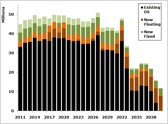
This is a continuation from Part 1 where we showed how to graph debt service and principal prior to the refinancing on the same chart as remaining and new debt service and principal.
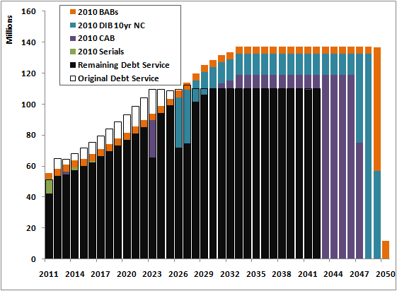
Debt service charts in public finance are as ubiquitous as business cards at a shortlist presentation and date back to before Lotus 123 offered WYSIWYG. Unfortunately, they usually don’t look much different despite just a few improvements in technology over the last 20+ years. But what can you do to make a principal and interest graph sizzle? The answer is *a bunch of stuff* particularly with Excel 2007's new graphics engine. One rule of thumb (and pet peeve of ours): do not ever make your chart in more dimensions than the data. Debt service is expressed as amount vs time – two dimensions, not three. Three dimensional bar charts, pie charts, etc. just distort the data you're trying to accurately convey. For more details on this, and definitely if you're not already familiar, read from the master of data visualization, Professor Edward Tufte. But back to debt service…